If you run a website, or send electronic messages, you’ll know how important it is to use colours to help things stand out.
It’s also important you design them with visually impaired people in mind as well, so as well as bright and attractive – they are also legible. This means getting the contrast right.
There are loads of tools to help with this, so it’s not as hard as it sounds.
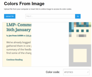
First of all find out what the hex code of your colours are. You can find out what these are by uploading an image (a screenshot, maybe) of your artwork here https://html-color-codes.info/colors-from-image/
Then you can check the contrast here https://webaim.org/resources/contrastchecker/
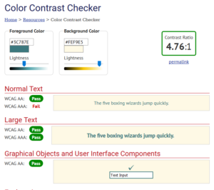
You’ll see from this that the contrast on the Migration Partnership Blog is just about okay (so long as the writing doesn’t get too small)
Comments are closed.